Why Streaming Menus Put Some Choices First
Why streaming menus put some choices first: learn to read rows, rankings and visual cues so you can compare the library before settling on a title.
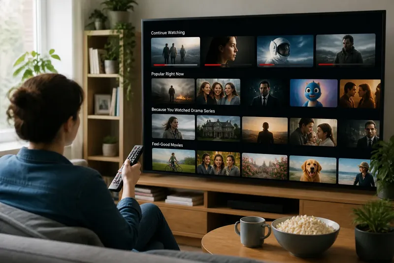
You open a streaming service to find a film and meet a wall of large pictures, named rows and a handful of titles already in focus. Why streaming menus put some choices first is not mysterious: the interface arranges a library into a viewing route, using grouping, order and visual emphasis to make some options easier to notice than others.
That route can be useful when you have a clear mood or little time to browse. It can also make the first visible row feel like the whole catalogue. Reading the menu as an interface, rather than a neutral shelf, helps you decide whether to follow its suggestions, change sections or search another way.
What does the first row tell you?
A row titled “Continue Watching” has a different job from one labelled “Popular” or “Because You Watched”. The first points back to activity on the account; the second signals a selected set of titles; the third links a current choice to other material the service considers related. The placement near the top gives each row a head start in your attention, but its label tells you what kind of selection it claims to be.
Rows are also a way of grouping. A service might sort titles by genre, mood, cast, release type or a recommendation theme. That makes a broad library easier to scan, much as a kitchen drawer with dividers is easier to use than one full of loose utensils. But the divider reflects a decision: the same film might fit several groups, while the interface can show it in only a limited number of places at once.
Look at the wording before treating a row as a ranking. “Trending” suggests current attention, while “Recommended for you” suggests personal relevance; neither phrase, by itself, tells you how a title was selected or whether it matches tonight’s taste. A label is a clue to the row’s purpose, not a verdict on what you should watch.
How do order and visual emphasis steer a scan?
Most menus make some items more prominent through position and size. The first row is encountered before the rows below it, and a wide banner or enlarged tile can occupy more of the screen than an ordinary card. Bright artwork, a short promotional caption or an automatic preview may draw the eye before you have read the title.
These cues are not all the same. Position determines what you encounter early; grouping determines what seems to belong together; visual emphasis gives particular items more screen presence. A title can be prominent without being the best match for you, just as a book displayed face-out in a shop is easier to spot than one spine-out on a shelf.
Horizontal rows add another subtle effect: the first few cards are visible, while later ones require a sideways move. If you stop at the first screenful, you have sampled only the portion the interface placed within immediate reach. Scrolling within a row can reveal alternatives that share the same label but differ in tone, length or subject.
Artwork deserves a quick check, too. A dramatic image may signal an intense story, but promotional art is not a reliable substitute for the synopsis, content description or genre label. When the mood matters, read the supporting text rather than letting the largest picture make the decision alone.
Which menu approach suits your evening?
Three common ways of browsing offer different kinds of help. The useful choice depends less on which one is “best” than on how much direction you want and what you already know.
- Follow a themed row. Rows organised around a genre, mood or shared feature suit viewers who want inspiration but are open to several kinds of title. Check the row label and scan more than the first card; the grouping may be broad, and its selection may not include every title that fits.
- Compare editorial or popular collections. Curated collections and popularity-led rows suit viewers who want a quick starting point based on a visible theme or a sign of current interest. They are less helpful if you want a narrowly personal match, so use the collection as a shortlist rather than a ranking of what deserves your time.
- Use a specific category or filter. Genre pages, language options and other available filters suit viewers who know a useful constraint, such as wanting animation or a particular language. They narrow the field more directly, though the category may still contain a wide mix of styles and moods.
Say you want a gentle film but have no title in mind. You open a “Feel-good” row, notice that its first card is an energetic comedy, and move across to read the descriptions on two quieter-looking titles. One synopsis mentions a low-key family story, so you open its details before deciding; the observable result is a more informed choice, not a promise that the film will match your mood.
For a specific actor, subject or title, searching is often more direct than comparing broad rows. For an uncertain mood, a themed collection may offer more useful variety. A category or filter sits between those approaches: it narrows the menu without requiring you to know the exact title.
How can you compare sections before choosing?
Give the menu a small, deliberate scan instead of selecting the first prominent tile. Start by naming what you want from the session: a genre, a mood, a familiar series, a particular language or simply something short enough to fit the time available. Then compare the labels on the visible rows with that preference.
- Read each relevant row label and distinguish personal recommendations from genre collections or popularity claims.
- Move across the row to see more than the first titles on screen.
- Compare a second section that serves a different purpose, such as a genre row against a mood collection.
- Open the details for a promising title and check its synopsis, format and any available content information.
- Choose from the small group that fits your stated preference, rather than treating screen position as a reason on its own.
This approach keeps browsing from turning into an endless tour of the home screen. It also gives you a clear stopping point: once a title fits the preference you named and its details look right, you can choose it without inspecting every row in the library.
What should you check before trusting a menu label?
Does “popular” mean popular with me?
Not necessarily. A popularity label describes the collection’s stated basis, not a personal match, so compare its titles with the mood or subject you actually want.
Are recommendations the same as a complete catalogue?
No. A recommendation row is a selected group, not a full inventory, and the menu may also organise the same title under other themes. Use categories or search when you want to look beyond the recommendations in view.
Why does the same title appear in different rows?
A title can fit several groupings, such as genre, mood and cast, so it may appear in more than one place. Repeated appearances can make it conspicuous, but they do not tell you whether it is a better fit than the other options.
When is direct search the better choice?
Search is useful when you already know a title, performer or subject to look for. If you only know the kind of experience you want, comparing a couple of labelled sections may expose options you would not have thought to type.
How do you choose without letting the menu choose for you?
Treat the top of the screen as a starting point, not a complete map. Read what each row claims to group, notice how position and artwork direct your eye, then compare a second route that matches your preference in a different way. This keeps the menu useful without mistaking prominence for suitability.
Why streaming menus put some choices first comes down to how a service makes a large library scannable: it groups titles, orders sections and gives selected cards extra attention. Once you can tell those functions apart, the practical question is simple: does this row help with what you want now, or should you move to another section? That question is often enough to turn browsing into a choice.